Vue 3 Options API vs Composition API vs Composables — A Practical Comparison
A comparison of Vue 3 APIs to help you choose your preferred development style.
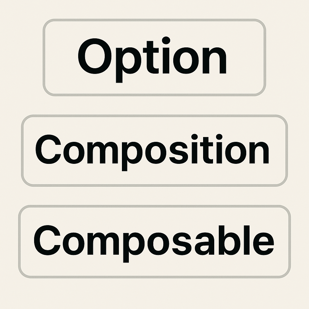
When building Vue 3 apps, you have several ways to organize your code. The three main approaches are:
- Options API (classic, Vue 2 style)
- Composition API (Vue 3's new, flexible approach)
- Composables (reusable logic with Composition API)
This guide compares all three, using the same real-world scenario: fetching and displaying a list of users.
Why Does This Matter?
Choosing the right API style affects your code's readability, scalability, and reusability. Let's see how each approach works in practice.
About $http
Note:
In the code examples below,$httprefers to a globally available HTTP client, as set up in Set up Laravel Sanctum API Authentication for Inertia.js Frontends.
In that guide, we use Axios and attach it towindow.$httpfor convenience.You can use any HTTP client you prefer—such as Axios, the native Fetch API, or others.
Just replace$http.get('users')with your preferred method for making HTTP requests.
1. Options API (Classic Vue 2 Style)
The Options API organizes code by options (data, methods, mounted, etc.). It's beginner-friendly and great for small components.
<script lang="ts">
import { defineComponent } from 'vue';
import { User } from '@/types';
import UserList from '@/pages/Composable/Partials/UserList.vue';

export default defineComponent({
    name: 'OptionsApi',
    components: { UserList },
    data() {
        return { users: [] as User[] };
    },
    mounted() {
        this.fetchUsers();
    },
    methods: {
        async fetchUsers() {
            const { data } = await $http.get('users');
            this.users = data;
        },
    },
});
</script>

<template>
    <div class="flex-col">
        <div class="font-semibold">Options API</div>
        <UserList :users="users" />
    </div>
</template>
Best for: Beginners, small/simple components.
2. Composition API (Vue 3's Flexible Approach)
The Composition API lets you group logic by feature, not by option. It's more scalable and works great with TypeScript.
<script setup lang="ts">
import { onMounted, ref } from 'vue';
import { User } from '@/types';
import UserList from '@/pages/Composable/Partials/UserList.vue';

const users = ref<User[]>([]);

async function fetchUsers() {
    const { data } = await $http.get('users');
    users.value = data;
}

onMounted(() => {
    fetchUsers();
});
</script>

<template>
    <div class="flex-col">
        <div class="font-semibold">Composition API</div>
        <UserList :users="users" />
    </div>
</template>
Best for: Medium/large components, better TypeScript support.
3. Composables (Reusable Logic with Composition API)
Composables are functions that encapsulate reusable logic. They make it easy to share code across components.
Composable: useUsers.ts
import { onMounted, ref } from 'vue';
import { User } from '@/types';

export function useUsers() {
    const users = ref<User[]>([]);
    const fetchUsers = async () => {
        const { data } = await $http.get('users');
        users.value = data as User[];
    };
    onMounted(() => { fetchUsers(); });
    return { users };
}
Component using the composable:
<script setup lang="ts">
import { useUsers } from '@/pages/Composable/Composables/useUsers';
import UserList from '@/pages/Composable/Partials/UserList.vue';

const { users } = useUsers();
</script>

<template>
    <div class="flex-col">
        <div class="font-semibold">Using Composable</div>
        <UserList :users="users" />
    </div>
</template>
Best for: Large codebases, shared logic, maximum reusability.
🧪 Side-by-Side Comparison
You can render all three approaches together for a live comparison:
<script setup lang="ts">
import AppLayout from '@/layouts/AppLayout.vue';
import OptionsApi from '@/pages/Composable/Partials/OptionsApi.vue';
import CompositionApi from '@/pages/Composable/Partials/CompositionApi.vue';
import UsingComposables from '@/pages/Composable/Partials/UsingComposables.vue';

const breadcrumbs = [{ title: 'Composable', href: '/composable' }];
</script>

<template>
    <AppLayout :breadcrumbs="breadcrumbs">
        <div class="flex flex-col gap-4 p-4">
            <OptionsApi />
            <CompositionApi />
            <UsingComposables />
        </div>
    </AppLayout>
</template>
📊 Feature Comparison Table
| Feature/Aspect | Options API | Composition API | Composable (with Composition API) |
|---|---|---|---|
| Syntax | Object-based | Function-based (<script setup>) | Function-based, reusable |
| Logic Organization | Split across options | Grouped by feature | Grouped and reusable across components |
| Reusability | Low | Medium | High |
| TypeScript Support | Basic | Excellent | Excellent |
| Learning Curve | Easiest for beginners | Moderate | Moderate/Advanced |
| Scalability | Limited | Good | Excellent |
| Best For | Small/simple components | Medium/large components | Shared logic, large codebases |
| Vue 2 Support | Yes | No | No |
| Vue 3 Support | Yes | Yes | Yes |
📝 Conclusion
- Options API: Great for beginners and small projects.
- Composition API: More powerful for complex logic and scalability.
- Composables: Most flexible for reusable logic and large codebases.
Choose the style that fits your project's needs and your team's experience.
Personal note:
In my own projects, I often use a combination of all three approaches.
Start simple with the Options API, use the Composition API for more complex logic, and extract shared logic into composables as your app grows.
Further Reading
Tip: You can mix and match these approaches in a single project. Start simple, refactor to composables as your app grows!